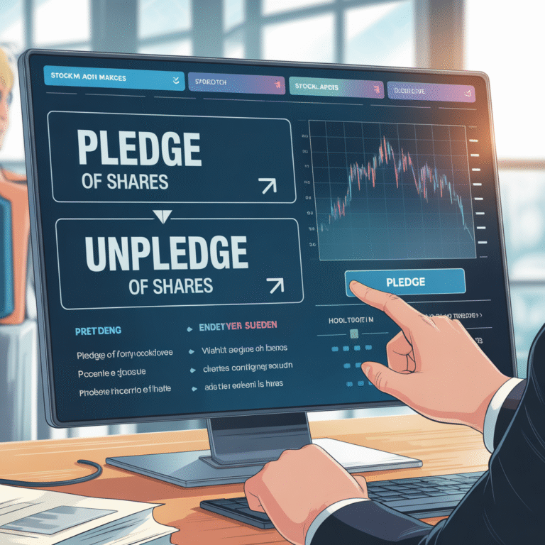
What is chart?
- In technical analysis, a chart is simply a graphical representation of a security’s historical price—and often volume—over a specified time frame.
- They help identify patterns, formations and trends of a security.
- Charts help traders analyze past and current price behavior to predict future trends and make trading decisions.
- Charts reveal whether a market is in an up‑trend (higher highs/lows), down‑trend (lower highs/lows), or trading sideways.
- charts helps to find Horizontal supports (where price tends to bounce) and resistances (where it tends to go up)
- chaers helps to identify Classic formations—triangles, head & shoulders, flags, double‑tops/bottoms shapes on a chart.
- using charts you can find breakouts, pullbacks, and candlestick signals (like hammers or dojis) can help you decide when to enter or close a position.
Types of Charts in Technical Analysis:
There are many types of charts available. But most popular and widely used among them are Line Charts, Bar Charts and the Candlestick Charts.
Line Chart:
A line chart connects a series of closing prices with a continuous line, showing the overall price trend over time. It uses only the closing price of each period, which filters out intraday noise. Line charts are very simple, making them useful for beginners. They are mainly used to spot overall uptrends or downtrends and key support/resistance levels. However, because they plot only closing prices, they do not show open, high, or low prices, so fine-grained price patterns are missed.
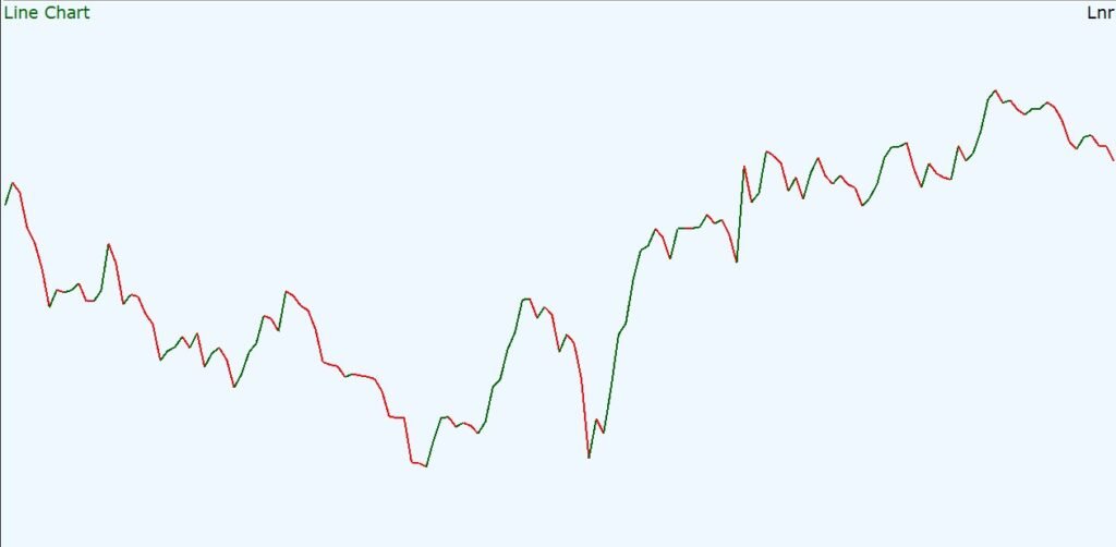
- Data Used: Closing prices only.
- Looks Like: One continuous line connecting each period’s closing price.
- Use Cases: Identifying long-term trends and major support/resistance.
- Pros: Very easy to read; reduces visual clutter.
- Cons: Ignores daily price range (open/high/low); hides short-term volatility and patterns.
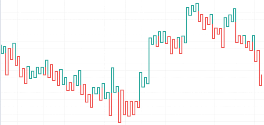
Bar Charts:
Bar charts plot Open-High-Low-Close (OHLC) data for each period as a vertical line so it also known as OHLC chart. The top of the bar marks the high, the bottom marks the low, and small ticks (usually left and right) mark the opening and closing prices. The bars are represented in green color when close is higher than open and red color when close is lower than open. The bar charts are more detailed than the line chart and are good for demonstrating or spotting the classical price patterns.
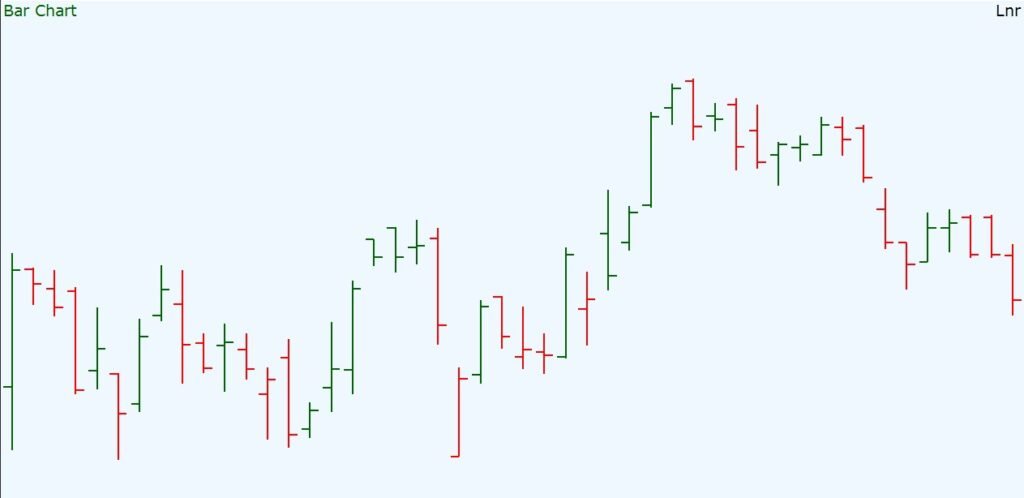
Bar charts are popular for both medium- and long-term analysis. They reveal more detail than line charts, making them useful for identifying classic chart patterns (double tops/bottoms, triangles, head-and-shoulders, etc.) as the shape of bars over time highlights these formations.
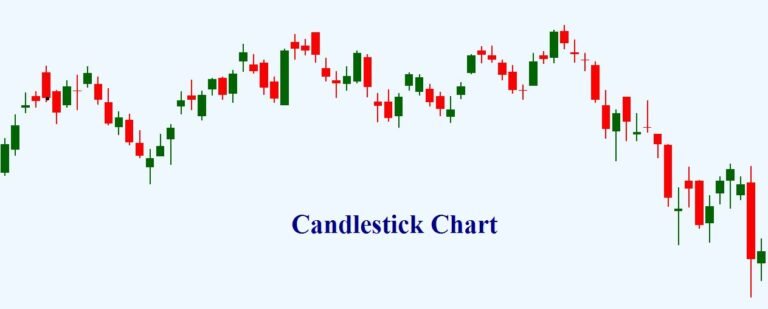
Candlestick Charts:
Candlestick chart was developed in 18th century by a Japanese rice trader named Homma Munehisa. Candlestick charts build on bar charts by using filled bodies for the open-close range. Each candle shows the same OHLC data, but the “body” (rectangle) is colored or shaded by direction: typically green/white for a close above open (bullish) and red/black for a close below open (bearish). “Wicks” or “shadows” extend above and below the body to show the high and low of the period. Candlestick charts are the most versatile and popular form of chart representation.
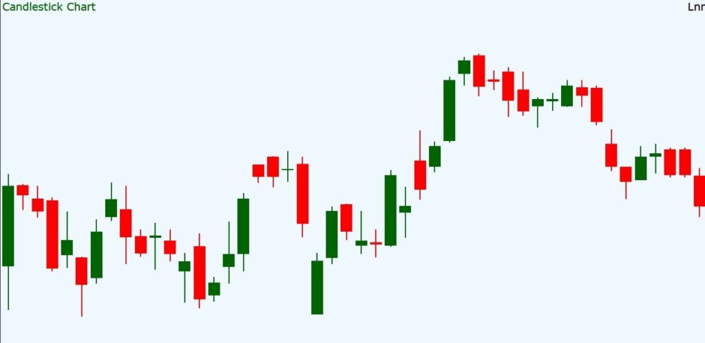
Traders look for one- to three-candle patterns (e.g. engulfing patterns, hammers, doji) to predict reversals or continuations. Candlestick charts “help traders analyze potential turning points” by illustrating the battle of bulls vs. bears more clearly than bars or lines. For example, a bullish engulfing pattern (one small down candle followed by a larger up candle) can signal a trend reversal.
Like bars, candlesticks focus on short-term price action. Their pattern signals are mostly short-term; relying solely on them can be risky. Longer-term investors often complement candlesticks with other indicators. (Candlesticks do not hide any extra data beyond bars.
Point-and-Figure Charts
Point-and-figure (P&F) charts take a different approach: they ignore time entirely and plot price changes as columns of X’s (rises) and O’s (falls) on a grid. Each column moves up or down only when price advances by a predetermined amount (“box size”), and reversals require a further set of boxes (commonly a 3-box reversal).
Point and Figure only draws when price moves meaningfully, it filters out day-to-day volatility. If price doesn’t move enough, the chart stays unchanged. This makes trend lines and breakouts very clear. Traders also use simple box-counting methods on P&F patterns to project targets.
- Data Used: Price moves in fixed “boxes” (usually closing prices or high/low) – no time component.
- Looks Like: Columns of X’s for up moves and O’s for down moves; each column only flips when price reverses enough.
- Use Cases: Removing market noise to find true trend, support/resistance; highlighting breakout points.
- Pros: Filters minor fluctuations, showing only meaningful moves; emphasizes key levels and trends.
- Cons: Ignores time entirely (no uniform time scale); not as intuitive for newbies; misses small price changes and volume.
Heikin-Ashi Charts
Heikin-Ashi (“average bar” in Japanese) is a variation of candlesticks that uses modified price data to filter noise. Each Heikin-Ashi candle is calculated by averaging the current and previous bar’s prices. This smooths out rapid fluctuations so trends stand out more clearly. Visually, Heikin-Ashi candles look like normal candles but with more consecutive same-colored bars and smaller wicks during trends. This makes it easier for beginners to spot sustained up or down trends. (Note: because HA uses averaged prices, the closing price shown is not the actual market close)
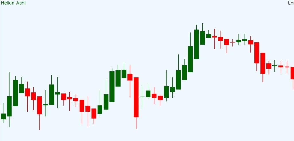
- Data Used: Recomputed OHLC using averages (modified from the original OHLC).
- Looks Like: Similar to candlesticks but smoother – often long bodies with few wicks when a trend is strong.
- Use Cases: Highlighting and following trends; reducing choppy movement.
- Pros: Filters out small swings (noise) to show clearer trends; easier to stay in a trend (fewer false reversals).
- Cons: Loses some detail (e.g. exact closing prices); can lag actual price since it’s averaged
Renko Charts
A Renko chart (from Japanese “brick”) also ignores time and draws bars (bricks) only when price moves a fixed amount.. Each “brick” is drawn diagonally (typically 45°) in the new direction when the price surpasses the previous brick’s size. For example, if the brick size is set to $1, a new up brick is added only after price rises $1 above the last brick’s top.. Renko charts look like a staircase of alternating red/green blocks. They excel at showing pure price trends and eliminating sideways noise.. The result is very smooth (fewer wiggles), which is good for trend-following. The trade-off is that Renko can lag during slow moves (no new brick until threshold is hit) and it ignores detailed intraday price swings.
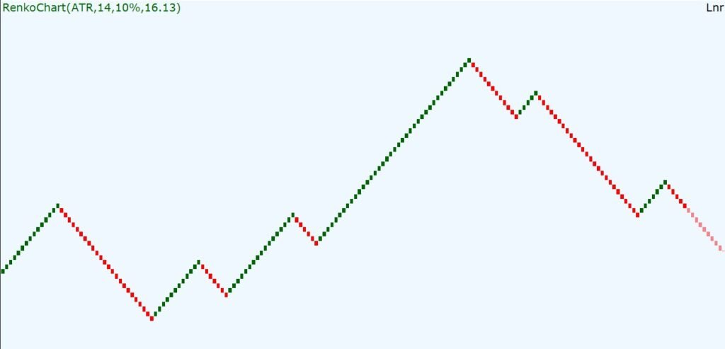
- Data Used: Price changes of fixed size (“bricks”) – often based on closing prices.
- Looks Like: Series of uniform bricks (squares), offset diagonally; color or direction marks up vs. down moves.
- Use Cases: Trend identification, clearer view of breakout/breakdown; smoothing price action.
- Pros: Filters out small fluctuations; makes sustained moves obvious.
- Cons: No time axis; can miss brief reversals (brick builds only on big moves); pattern signals can be delayed until moves exceed box size.
Kagi Charts
A Kagi chart (also Japanese) is composed of vertical lines connected by short horizontals, with line thickness changing when price breaks previous highs/lowsi. Like P&F and Renko, it ignores uniform time – the chart only moves when price changes enough. When price rises above the prior peak, the vertical line switches from thin to thick (a “yang” line); when it falls below the prior trough, it switches from thick to thin (a “yin” line). Traders use these thickness shifts as buy/sell signals. A Kagi chart highlights the overall trend without clutter: long vertical segments for trending moves, and only small horizontals on reversals. It’s good for identifying major trend reversals and filtering out sideways noise. However, Kagi charts can look unusual and are less common, so they have a learning curve.
- Data Used: Price levels (often closes) and a set reversal amount; no constant time intervals.
- Looks Like: Vertical bars of varying thickness (thin/red vs. thick/black), connected by short horizontal flips; no uniform time axis.
- Use Cases: Capturing trend direction changes; filtering noise to reveal key support/resistance shifts.
- Pros: Emphasizes true trend changes; ignores small fluctuations.
- Cons: Unfamiliar format for many; scale on time axis is irregular; thickness rules must be understood (relies on chosen reversal value).
Range Bar Charts
A Range Bar chart draws a new bar only when the price moves by a fixed range (e.g. $1), regardless of time. Each bar’s high minus low exactly equals that range (unless gaps occur). If price is calm (moves less than the range), no new bar appears, so quiet periods have no bars. In high-volatility, many bars appear rapidly. For example, setting a $0.10 range means a bar is made only after the price moves 10 cents. Range Bars remove the time element, focusing purely on price movement. This makes them useful for drawing clear trendlines and support/resistance – sideways choppiness is condensed. However, choosing the right range is critical: too small and it’s noisy, too large and you miss details.
- Data Used: Price movement of a fixed range per bar; open and close are either the range endpoints.
- Looks Like: Bars (like candles) each spanning exactly the chosen price range; bars appear irregularly in time.
- Use Cases: Highlighting volatility and trend without time bias; easier drawing of trendlines/support due to uniform bar size.
- Pros: Standardizes move size; filters out small back-and-forth action; emphasizes true volatility.
- Cons: Requires experimentation to set range; not standard on all platforms; very irregular time spacing.
Tick Charts
A Tick chart (often called a tick bar chart) creates each bar based on a fixed number of trades (ticks), not on time. For example, a 500-tick chart plots a new bar every 500 trades. Each bar’s height still shows high/low, but its time width varies with trading speed. Tick charts give an equal amount of trade activity per bar, so busy periods produce many bars quickly, while slow periods produce few bars. Traders sometimes use tick charts to see volume flow: combining tick bars with actual trade volume can reveal when large trades move the market. Their downside is that tick charts can be irregular in time and less intuitive for beginners. They are most useful for short-term trading when you want to analyze action based on activity rather than clock time.
- Data Used: A set number of trades per bar (configurable tick count)
- Looks Like: Visually similar to time bars (OHLC bars), but each bar represents the same count of trades; spacing on time axis is uneven.
- Use Cases: High-frequency or scalping strategies; detecting shifts in volume/participation; filtering by trade count.
- Pros: Bars represent uniform market activity; can reduce “emptier” periods; useful to combine with volume.
- Cons: Time axis becomes irregular; requires heavy data (every tick); less common format, can confuse beginners.
Comparison of Chart Types
| Chart Type | Visual Characteristics | Data Used | Best Use Cases | Advantages | Disadvantages |
|---|---|---|---|---|---|
| Line Chart | Single line connecting each period’s closing prices. | Closing prices only | Identifying broad trends, support/resistance | Very simple and clean; filters out intraday noise | Misses open/high/low information; can hide short-term patterns. |
| Bar Chart (OHLC) | Vertical bar (high-low range) with left tick = open, right tick = close. Colored for up/down. | Open/High/Low/Close each period | Spotting volatility, chart patterns, trend lines | Shows full price range; color ticks show up/down movement. | More cluttered; contains market “noise”; harder to read for beginners. |
| Candlestick | Rectangle body (open–close) with wicks (high/low). Color indicates up/down. | Open/High/Low/Close each period | Recognizing classic patterns, daily sentiment, trends | Combines OHLC info clearly; colored bodies make direction obvious. | Still noisy; non-experts may misread patterns; does not filter volatility. |
| Heikin-Ashi | Similar to candlesticks but smoother – often long bodies and small wicks. | Modified (averaged) OHLC | Trend-following, reducing whipsaws | Smooths out noise to highlight trends; easier to see trend strength. | Loses exact price information (uses averages); can lag during reversals. |
| Point & Figure | Columns of X’s (rising) and O’s (falling); no time scale. | Price moves by fixed boxes (close or high/low) | Filtering noise; identifying strong trend/support levels | Removes time and tiny moves; highlights significant moves only. | Ignores small price moves and volume; unconventional for beginners; time not represented. |
| Renko | Series of equal-size bricks (45° squares) colored up/down. | Price movement of fixed brick size | Trend clarity; eliminating small fluctuations | Filters minor swings; very smooth trends. | No time axis; can lag (brick forms only after a big move); misses smaller reversals. |
| Kagi | Vertical lines of varying thickness (thin/thick) connected by short horizontals. | Price changes (typically closing prices) and reversal threshold | Emphasizing trend changes; noise reduction | Clearly shows supply/demand shifts (thick vs. thin); filters side movements. | Irregular time axis; requires understanding of yin/yang rules; not widely used. |
| Range Bars | Candlestick/bar whose high–low equals a fixed range; spacing irregular (no time). | Price moves to fill a set range per bar | Trendlines and volatility analysis without time bias | Standardizes moves; reduces sideways noise; makes trends more evident. | Choosing range is tricky; not common on all platforms; irregular time can confuse new users. |
| Tick Chart | OHLC bars based on a fixed number of trades per bar. | Count of transactions (ticks) per bar | High-activity trading; volume-based analysis | Equalizes trade count per bar; highlights trading intensity; good with volume data. | Time intervals vary; data-heavy; less intuitive (bars don’t align with clock time). |