In the fast-paced world of stock trading and technical analysis, candlestick charts stand out as a powerful visual tool for understanding market trends and price movements. If you’re new to investing or looking to sharpen your skills, mastering candlestick charts can give you an edge in predicting market behavior. This guide explains what a candlestick chart is, how it works, and some of the best candlestick patterns to watch for. Whether you’re trading stocks, forex, or cryptocurrencies, these insights can help you make informed decisions.
What Is a Candlestick Chart?
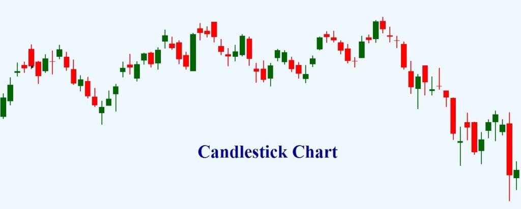
A candlestick chart is a type of financial chart used to represent the price movements of an asset over a specific period. Originating from Japanese rice traders in the 18th century, these charts have become a staple in modern technical analysis due to their ability to convey a wealth of information in a single glance.
Each “candlestick” on the chart represents four key data points for a given time frame (e.g., one day, one hour, or even one minute):
- Open Price: The price at which the asset started trading during the period.
- Close Price: The price at which the asset ended the period.
- High Price: The highest price reached during the period.
- Low Price: The lowest price reached during the period.
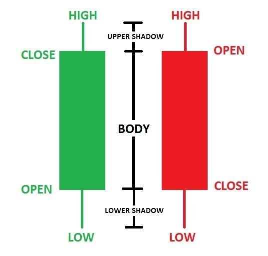
The candlestick consists of a rectangular body and thin lines called “wicks” or “shadows.” The body shows the range between the open and close prices, while the wicks extend to the high and low prices.
- If the close is higher than the open, the body is typically colored green or white, indicating bullish (upward) momentum.
- If the close is lower than the open, the body is red or black, signaling bearish (downward) pressure.
Candlestick charts are favored over traditional bar or line charts because they highlight market sentiment more intuitively, making it easier to spot trends, reversals, and continuations.
How to Read Candlestick Charts Effectively
To get the most out of candlestick charts, focus on patterns formed by one or more candles. These patterns can signal potential buy or sell opportunities. Always combine them with other indicators like volume, moving averages, or support/resistance levels for better accuracy. Remember, no pattern is foolproof—market conditions like news events can influence outcomes.
Look for these elements when reading charts:
- Trend Direction: A series of green candles suggests an uptrend; red ones indicate a downtrend.
- Volatility: Long wicks show high volatility, with buyers and sellers battling for control.
- Volume Confirmation: High trading volume during a pattern strengthens its reliability.
Now, let’s dive into some of the best candlestick patterns that traders rely on.
Best Candlestick Patterns for Traders
Candlestick patterns are categorized as bullish (suggesting price increases), bearish (indicating declines), or neutral (showing indecision). Here are five essential ones, explained with real-world context:
1. Doji
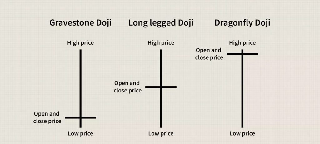
The Doji is a neutral pattern that looks like a cross or plus sign, where the open and close prices are virtually the same. It signals market indecision and often appears at the end of a trend.
- Bullish Doji (Dragonfly Doji): After a downtrend, it may indicate a reversal as sellers lose steam.
- Bearish Doji (Gravestone Doji): Following an uptrend, it could signal weakening buyers.
- Why It’s Useful: Spotting a Doji can alert you to potential trend changes. For example, in stock trading, a Doji after a sharp drop might precede a rally.
2. Hammer and Inverted Hammer
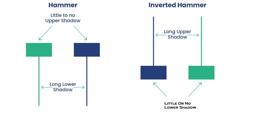
The Hammer is a bullish reversal pattern with a small body at the top and a long lower wick (at least twice the body length). It forms after a downtrend, showing that sellers pushed prices low but buyers fought back.
- The Inverted Hammer is similar but with a long upper wick, suggesting buyers tested higher prices.
- Trading Tip: Confirm with the next candle closing higher. This pattern often appears in forex markets during oversold conditions.
3. Shooting Star
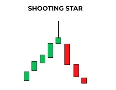
A bearish reversal pattern, the Shooting Star has a small body at the bottom and a long upper wick. It occurs after an uptrend, indicating that buyers drove prices high but sellers took over, closing near the open.
- Key Insight: Look for it at resistance levels. In crypto trading, a Shooting Star might signal the end of a pump.
4. Bullish and Bearish Engulfing
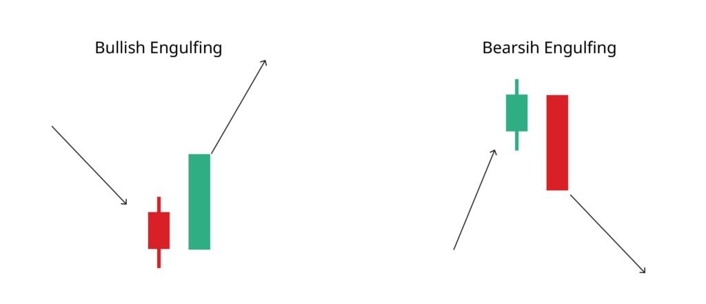
The Engulfing pattern involves two candles: The second completely “engulfs” the body of the first.
- Bullish Engulfing: A red candle followed by a larger green one, signaling a shift from bearish to bullish. Ideal after a downtrend.
- Bearish Engulfing: A green candle followed by a larger red one, indicating a potential downturn.
- Pro Tip: High volume enhances reliability. This is a favorite in day trading for quick entries.
5. Morning Star and Evening Star
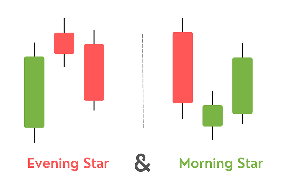
These are three-candle reversal patterns.
- Morning Star (Bullish): A long red candle, followed by a small-bodied candle (like a Doji) that gaps down, then a long green candle closing above the midpoint of the first. It predicts a trend reversal upward.
- Evening Star (Bearish): The opposite, starting with a green candle, a gapped-up small body, and a red candle closing below the first’s midpoint.
- Application: Common in commodity markets, these patterns provide strong signals when aligned with fundamentals.
Conclusion: Start Using Candlestick Charts Today
Candlestick charts offer a dynamic way to visualize market psychology, helping traders identify opportunities and manage risks. By learning patterns like the Doji, Hammer, and Engulfing, you can enhance your trading strategy. Practice on demo accounts or free charting tools like TradingView to build confidence. Remember, successful trading combines patterns with discipline and risk management—never rely on one signal alone.
Ready to dive deeper? Explore advanced patterns or backtest these on historical data.
Keywords: candlestick chart explained, best candlestick patterns, trading candlestick patterns, beginner guide to candlesticks